
After doing some more research and experimentation, we've decided to move the blog over to Wordpress. All of the previous posts have been switched over so you can still go back and look at those if you'd like. We're working on getting the link from the website changed, but in the meantime, head over to the new blog and check out the new format!
Thursday, December 3, 2009
Wednesday, December 2, 2009
Mass Transit and the Restructuring of Cities
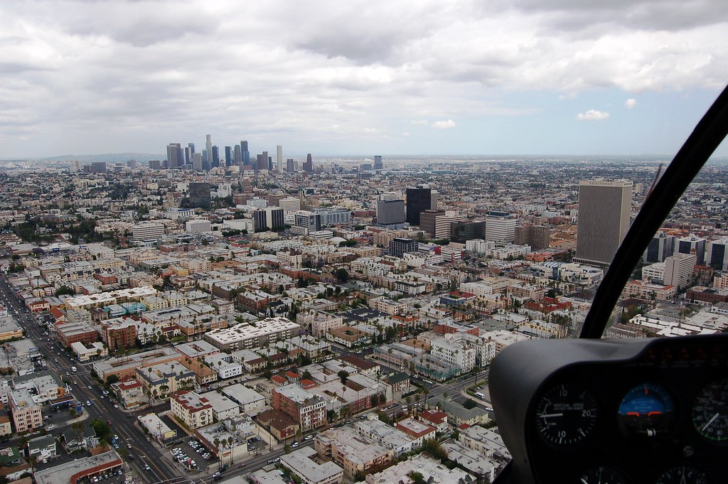
We haven’t always been a car culture. Writing from the heart of the sprawling, cancerous, Los Angeles metropolitan area, it’s a bit hard to believe. Nowadays environmentalists and urban planners alike strive to reign in the automobile and create a system based around rapid mass transportation and walkable, bike-able pathways.
What may come as a surprise to many people, however, is that at the end of the 18th and beginning of the 19th century, that system was already in place! In 1897, an article in the Los Angeles times proclaimed: “There is no part of the world where cycling is in greater favor than in Southern California, and nowhere on the American continent are conditions so favorable the year round for wheeling.” This was based on the 30,000 frequent riders in the LA area! In fact, the Good Roads movement, the first influential road building movement in the United States, was started not by automobile interests, but the League of American Wheelmen – a bicycle organization. One particular example of an early attempt at bike infrastructure took place in 1900, when a millionaire named Horace Dobbins nearly succeeded in constructing a bicycle path on an “elevated, multilane, wooden structure” with scenic views that would stretch from Los Angeles to Pasadena.


Today, cars are a burden more enormous than most people even come close to imagining. Roads themselves constitute one of the largest investments of Federal dollars in US history. They have transformed the human landscape and our relationship both to the land and each other in far-reaching and omnipresent ways. But they also have more insidious consequences that most of us don’t think about. The ratio of parking area to total land in Los Angeles is 81%. That means for every office building, grocery store, or school, there are four parking lots of equal size. This seeming overabundance of parking occurs because “conservative estimates identify an average of four parking spots per vehicle” in LA. There are 3.8 million people living in Los Angeles proper – if even 1/2 of them have cars (and that’s a very conservative estimate) that means that there are nearly 8 million parking spots in the city. And cost? “The cost of all parking spaces in the US exceeds the value of all cars and may even exceed the value of all roads.” The cost of parking subsidies is somewhere between $127 and $347 billion annually, according to Donald Shoup, professor of urban planning at UCLA. To put some perspective on this, the US Department of Education has a budget of $158.4 billion (including significant additional funds from the recovery bill). No wonder we’re the world’s largest polluter behind China and we have an educational system in tatters.
Anyone who’s ever seen “Who Killed the Electric Car” knows about the EV debacle. For those who haven’t, let me briefly summarize. In 1990 the California Air Resources Board passed a mandate that called for a certain percentage of all cars on the road to be zero-emission vehicles. The percentage ramped up from 2% to 10% over the course of 13 years. Car companies initially responded, producing electric cars like GM’s EV1, a well-designed car that got 90 per charge and could be charged in a garage or at the numerous electric vehicle charging stations installed around California. It had zero emissions, and people who drove it raved about it. But even as they complied, the car companies simultaneously fought the legislation, eventually suing the state and getting CARB to drop the mandate. GM pulled all of it’s EV1’s off of the road and crushed them. Nearly 20 years later, we’re just getting excited about hybrid vehicles.
All of this has tremendous impact on urban planning and the architecture within our cities. On an aesthetic level, buildings in downtown areas and along freeways have been designed to appeal to people doing 60mph plus, rather than to the pedestrian on the street. On a more fundamental level, the way we move through our societies determines the special layout of our built environment. Cars reduce urban density in two ways: first, by requiring a huge amount of space that fragments the urban core, and second, by making lengthy commutes and suburban sprawl viable.
Any attempts at densification or the restructuring of the built environment toward more sustainable, integrated systems require that we first address transportation. Only by changing the way people interact with the built landscape can we then change the structure of that landscape.
Sources: 20th-Century Sprawl, Reinventing Los Angeles, Who Killed the Electric Car.
What may come as a surprise to many people, however, is that at the end of the 18th and beginning of the 19th century, that system was already in place! In 1897, an article in the Los Angeles times proclaimed: “There is no part of the world where cycling is in greater favor than in Southern California, and nowhere on the American continent are conditions so favorable the year round for wheeling.” This was based on the 30,000 frequent riders in the LA area! In fact, the Good Roads movement, the first influential road building movement in the United States, was started not by automobile interests, but the League of American Wheelmen – a bicycle organization. One particular example of an early attempt at bike infrastructure took place in 1900, when a millionaire named Horace Dobbins nearly succeeded in constructing a bicycle path on an “elevated, multilane, wooden structure” with scenic views that would stretch from Los Angeles to Pasadena.

Today, cars are a burden more enormous than most people even come close to imagining. Roads themselves constitute one of the largest investments of Federal dollars in US history. They have transformed the human landscape and our relationship both to the land and each other in far-reaching and omnipresent ways. But they also have more insidious consequences that most of us don’t think about. The ratio of parking area to total land in Los Angeles is 81%. That means for every office building, grocery store, or school, there are four parking lots of equal size. This seeming overabundance of parking occurs because “conservative estimates identify an average of four parking spots per vehicle” in LA. There are 3.8 million people living in Los Angeles proper – if even 1/2 of them have cars (and that’s a very conservative estimate) that means that there are nearly 8 million parking spots in the city. And cost? “The cost of all parking spaces in the US exceeds the value of all cars and may even exceed the value of all roads.” The cost of parking subsidies is somewhere between $127 and $347 billion annually, according to Donald Shoup, professor of urban planning at UCLA. To put some perspective on this, the US Department of Education has a budget of $158.4 billion (including significant additional funds from the recovery bill). No wonder we’re the world’s largest polluter behind China and we have an educational system in tatters.
Anyone who’s ever seen “Who Killed the Electric Car” knows about the EV debacle. For those who haven’t, let me briefly summarize. In 1990 the California Air Resources Board passed a mandate that called for a certain percentage of all cars on the road to be zero-emission vehicles. The percentage ramped up from 2% to 10% over the course of 13 years. Car companies initially responded, producing electric cars like GM’s EV1, a well-designed car that got 90 per charge and could be charged in a garage or at the numerous electric vehicle charging stations installed around California. It had zero emissions, and people who drove it raved about it. But even as they complied, the car companies simultaneously fought the legislation, eventually suing the state and getting CARB to drop the mandate. GM pulled all of it’s EV1’s off of the road and crushed them. Nearly 20 years later, we’re just getting excited about hybrid vehicles.
All of this has tremendous impact on urban planning and the architecture within our cities. On an aesthetic level, buildings in downtown areas and along freeways have been designed to appeal to people doing 60mph plus, rather than to the pedestrian on the street. On a more fundamental level, the way we move through our societies determines the special layout of our built environment. Cars reduce urban density in two ways: first, by requiring a huge amount of space that fragments the urban core, and second, by making lengthy commutes and suburban sprawl viable.
Any attempts at densification or the restructuring of the built environment toward more sustainable, integrated systems require that we first address transportation. Only by changing the way people interact with the built landscape can we then change the structure of that landscape.
Sources: 20th-Century Sprawl, Reinventing Los Angeles, Who Killed the Electric Car.
Wednesday, September 16, 2009
1) Peel the earth open. 2) play sports.
China is a country known for many things – overwhelming numbers of people, stunning monuments, communism, and more. In recent years, however, the lens through which everyone seems to be analyzing China is an environmental one. According to the world bank, 16 of the world’s 20 most polluted cities are in China. In 2006, China built an average of two coal plants per week. As China becomes industrialized and it’s citizens become integrated into global consumer society, there are profound environmental issues that have to be dealt with – profound because no country on earth holds more influence on the environmental future of our world.
But another thing that China is known for is it’s incredible sports stadiums. During the 2008 Olympics, China showed off “The Birdsnest,” it’s remarkable multipurpose sports complex that awed the world with it’s unique design. “The Watercube” housed the swim and dive competitions, again drawing praise for it’s beautiful design.
We all know, however, that the issues of sports and the environment, at least in China, are anything but disparate. One of the most talked about issues before the Beijing Olympics was the air quality - an issue only resolved when Beijing spent months reducing pollution in preparation for the games.
A new proposal for a stadium in Dalian, China, manages to redefine the essence of the stadium by opening it up to nature in a way that is quite like anything we’ve ever seen before. The Dalian Shide stadium, designed by NBBJ Architects (out of LA), takes into account far more than just sports. There are large cutouts in the walls at the ends of the stadium that open the stadium up to views of the city and the mountains behind it, as well as to the ocean. A large plaza at either end invites people into the space, helping integrate it into the surrounding city, rather than functioning as a closed event.
But by far the greatest aspect of the stadium, and the thing that makes it so truly unique is the enormous exterior walls that are entirely covered with living plants and grass. The effect is really that of having peeled back the earth to form a stadium.
As for more conventional green measures, solar panels and wind turbines in the walls will generate most of the power, and an extensive water collection system will be used for irrigation and plumbing. The pavement around the stadium will also be porous, preventing the runoff of chemicals and increasing filtration of rainwater.
This is a project that seems, to me at least, similar to the Dragonfly tower I brought up in a previous post about urban farming. Its huge scale and innovation make it seem like a thing of the distant future. But while that’s true certainly of the Dragonfly tower (unless they try to build it somewhere other than Manhattan maybe…), it isn’t necessarily the case with the Dalian Shide stadium. China has the space, the need, and perhaps most importantly, the government force to build a monument like this.
But what I admire most about the building is not how green it is. It’s the way it addresses multiple issues. It’s a building in tune with it’s surroundings, both in a direct, physical sense, as well as a global environmental sense, but it also takes into account people. By inviting people in, by creating a sense of community and pride around so iconic a structure, especially in a country as crucial and important as China, the Chinese government would be furthering the environmental movement in ways that no building in the United States or elsewhere possibly could.
Source: Inhabitat, NBBJ
But another thing that China is known for is it’s incredible sports stadiums. During the 2008 Olympics, China showed off “The Birdsnest,” it’s remarkable multipurpose sports complex that awed the world with it’s unique design. “The Watercube” housed the swim and dive competitions, again drawing praise for it’s beautiful design.
We all know, however, that the issues of sports and the environment, at least in China, are anything but disparate. One of the most talked about issues before the Beijing Olympics was the air quality - an issue only resolved when Beijing spent months reducing pollution in preparation for the games.

A new proposal for a stadium in Dalian, China, manages to redefine the essence of the stadium by opening it up to nature in a way that is quite like anything we’ve ever seen before. The Dalian Shide stadium, designed by NBBJ Architects (out of LA), takes into account far more than just sports. There are large cutouts in the walls at the ends of the stadium that open the stadium up to views of the city and the mountains behind it, as well as to the ocean. A large plaza at either end invites people into the space, helping integrate it into the surrounding city, rather than functioning as a closed event.
But by far the greatest aspect of the stadium, and the thing that makes it so truly unique is the enormous exterior walls that are entirely covered with living plants and grass. The effect is really that of having peeled back the earth to form a stadium.

As for more conventional green measures, solar panels and wind turbines in the walls will generate most of the power, and an extensive water collection system will be used for irrigation and plumbing. The pavement around the stadium will also be porous, preventing the runoff of chemicals and increasing filtration of rainwater.
This is a project that seems, to me at least, similar to the Dragonfly tower I brought up in a previous post about urban farming. Its huge scale and innovation make it seem like a thing of the distant future. But while that’s true certainly of the Dragonfly tower (unless they try to build it somewhere other than Manhattan maybe…), it isn’t necessarily the case with the Dalian Shide stadium. China has the space, the need, and perhaps most importantly, the government force to build a monument like this.

But what I admire most about the building is not how green it is. It’s the way it addresses multiple issues. It’s a building in tune with it’s surroundings, both in a direct, physical sense, as well as a global environmental sense, but it also takes into account people. By inviting people in, by creating a sense of community and pride around so iconic a structure, especially in a country as crucial and important as China, the Chinese government would be furthering the environmental movement in ways that no building in the United States or elsewhere possibly could.
Source: Inhabitat, NBBJ
Tuesday, August 4, 2009
Outsider Architecture
Outsider architecture is the name given to architectural projects undertaken by non-architects. It isn’t as common as you might think, considering the stringent laws governing new buildings – what can be built, where it can be build, how it must be built, and who must design, review, and construct it. These kinds of rules are hardly exclusive to the United States, so even in the world as a whole, outsider architecture usually manifests itself in small, unregulated towns and villages, or else as guerrilla projects undertaken in secret at remote locations.
Outsider architecture encompasses everything from the tool shed you designed and built in your back yard, to the 12-acre sculpture complex one man built in the middle of an Indian nature reserve (Nek Chand Sani). And although your tool shed is undoubtedly fine, it’s these larger scale endeavors that have something to teach us about architecture, design, and human spirit, through their blurring of the distinction between art and architecture and the way their form expresses their function.


One of these projects that raises questions about what constitutes architecture is a driftwood complex built by a single artist in the corner of a small nature preserve in Sweden. In 1980, Lars Vilks began construction of this wooden fort that would eventually become known as Nimis, latin for “too much.” The construct wasn’t discovered until two years later by Swedish authorities, who deemed it a “house” and therefore illegally built in the preserve. Vilks meanwhile sold Nimis to the artists Christo and Jeanne-Claude (the legal documents for the sale were a piece of driftwood). A legal battle ensued, and in 1996 (apparently Swedish legal battles last as long as American ones) Vilks declared the area surrounding Nimis and his smaller sculpture, Arx, the independent nation of Ladonia.

In case that history isn’t weird enough for you, things get even sillier. The nation of Ladonia, though not formally recognized by any other nation, boasts 14,000 citizens, all of whom are supposedly “nomads,” since no one actually lives in Ladonia. The national flag is a green Nordic cross on an identically green background. In 2006, the Armed Coalition Forces of the Internets formally declared war on Ladonia. And in 2002, Vilks claimed that 3,000 Pakistanis had applied for immigrant status, apparently missing the satirical nature of the “country.”
Despite its convoluted history and dubious legal validity, Nimis remains standing. And no matter what your feelings are on Ladonia, Nimis deserves your respect. The fortress is comprised of 70 tons of driftwood and nails, and boasts a nine-story tower (remember, it was built in secret by one man). It is hardly a livable “building,” but it seems unquestionably to constitute “architecture.”

I think what this particular example of outsider architecture has to show us is the innate desire we have to erect monuments independent of function. It’s easy to get lost in the intended use of a building, or the carbon footprint it will posses, but it’s important to not lose sight of the human attachment we have to places and to structures. Projects like Nimis, and like Nek Chand Sani also remind us that while rules and regulations may have their place, some of the most spectacular human achievements come when people break away from the laws of society and construct uniquely personal structures.
We don’t need armies of renegade architects creating illegal monuments out in the woods, but we do occasionally need people like Lars Vilks to show us another side of architecture, and the passion and fun that it can inspire.
Sources: Atlas Obscura, Wikipedia
Outsider architecture encompasses everything from the tool shed you designed and built in your back yard, to the 12-acre sculpture complex one man built in the middle of an Indian nature reserve (Nek Chand Sani). And although your tool shed is undoubtedly fine, it’s these larger scale endeavors that have something to teach us about architecture, design, and human spirit, through their blurring of the distinction between art and architecture and the way their form expresses their function.
One of these projects that raises questions about what constitutes architecture is a driftwood complex built by a single artist in the corner of a small nature preserve in Sweden. In 1980, Lars Vilks began construction of this wooden fort that would eventually become known as Nimis, latin for “too much.” The construct wasn’t discovered until two years later by Swedish authorities, who deemed it a “house” and therefore illegally built in the preserve. Vilks meanwhile sold Nimis to the artists Christo and Jeanne-Claude (the legal documents for the sale were a piece of driftwood). A legal battle ensued, and in 1996 (apparently Swedish legal battles last as long as American ones) Vilks declared the area surrounding Nimis and his smaller sculpture, Arx, the independent nation of Ladonia.
In case that history isn’t weird enough for you, things get even sillier. The nation of Ladonia, though not formally recognized by any other nation, boasts 14,000 citizens, all of whom are supposedly “nomads,” since no one actually lives in Ladonia. The national flag is a green Nordic cross on an identically green background. In 2006, the Armed Coalition Forces of the Internets formally declared war on Ladonia. And in 2002, Vilks claimed that 3,000 Pakistanis had applied for immigrant status, apparently missing the satirical nature of the “country.”
Despite its convoluted history and dubious legal validity, Nimis remains standing. And no matter what your feelings are on Ladonia, Nimis deserves your respect. The fortress is comprised of 70 tons of driftwood and nails, and boasts a nine-story tower (remember, it was built in secret by one man). It is hardly a livable “building,” but it seems unquestionably to constitute “architecture.”
I think what this particular example of outsider architecture has to show us is the innate desire we have to erect monuments independent of function. It’s easy to get lost in the intended use of a building, or the carbon footprint it will posses, but it’s important to not lose sight of the human attachment we have to places and to structures. Projects like Nimis, and like Nek Chand Sani also remind us that while rules and regulations may have their place, some of the most spectacular human achievements come when people break away from the laws of society and construct uniquely personal structures.
We don’t need armies of renegade architects creating illegal monuments out in the woods, but we do occasionally need people like Lars Vilks to show us another side of architecture, and the passion and fun that it can inspire.
Sources: Atlas Obscura, Wikipedia
Wednesday, July 29, 2009
Incorporating Structures into their Environment
Seamless environmental integration isn’t just a matter of aesthetic taste. By taking the time to evaluate the properties and spatial form of the surrounding area, we can design buildings that are more efficient and simple, as well as beautiful.
A terrific example of this done right comes from the Netherlands, where the Dutch have designed a floating apartment complex. Almost all of the Netherlands is located below sea level, so flooding is a huge concern, and water is frequently pumped out of low lying areas. In order to move beyond this struggle with nature, Dutch architect Koen Olthuis has designed “The Citadel,” the first structure in the “New Water” development.
And although there are some difficulties in building a floating building, like corrosion and maintenance, the complex is expected to use 25% less energy than similar land-based buildings, thanks to the temperature regulating nature of the water.
A spectacular example of the type of nature-blind, ostentatious thinking that has gotten us into the mire of global warming and other problems, is the new “Blue Crystal” building in – where else – Dubai.
The architects claim that a photovoltaic system set up in the ice shell will generate enough electricity to make the whole project self-sustaining. As crazy as this project seems, it’s hard to fault the people behind Blue Crystal if they can pull off energy indepencence. As an isolated example, it doesn’t really matter how big its energy expenditures are so long as they are covered by onsite generation. One could argue that that PV electricity could be used to power surrounding buildings, but then the ice hotel would lose its primary draw, and wouldn’t be built at all.
We’ve been down that road, and we’ve seen where it leads. We don’t need to compromise comfort in order to build sustainable buildings. But we do have to abandon the notion that we can do whatever we like with our structures. To truly achieve sustainability, we have to adapt to nature, not to adapt nature to our purposes.
For more information and source photos, see Inhabitat: The Citadel, and Inhabitat: Blue Crystal.
A terrific example of this done right comes from the Netherlands, where the Dutch have designed a floating apartment complex. Almost all of the Netherlands is located below sea level, so flooding is a huge concern, and water is frequently pumped out of low lying areas. In order to move beyond this struggle with nature, Dutch architect Koen Olthuis has designed “The Citadel,” the first structure in the “New Water” development.

And although there are some difficulties in building a floating building, like corrosion and maintenance, the complex is expected to use 25% less energy than similar land-based buildings, thanks to the temperature regulating nature of the water.

A spectacular example of the type of nature-blind, ostentatious thinking that has gotten us into the mire of global warming and other problems, is the new “Blue Crystal” building in – where else – Dubai.

The architects claim that a photovoltaic system set up in the ice shell will generate enough electricity to make the whole project self-sustaining. As crazy as this project seems, it’s hard to fault the people behind Blue Crystal if they can pull off energy indepencence. As an isolated example, it doesn’t really matter how big its energy expenditures are so long as they are covered by onsite generation. One could argue that that PV electricity could be used to power surrounding buildings, but then the ice hotel would lose its primary draw, and wouldn’t be built at all.

We’ve been down that road, and we’ve seen where it leads. We don’t need to compromise comfort in order to build sustainable buildings. But we do have to abandon the notion that we can do whatever we like with our structures. To truly achieve sustainability, we have to adapt to nature, not to adapt nature to our purposes.
For more information and source photos, see Inhabitat: The Citadel, and Inhabitat: Blue Crystal.
Friday, July 17, 2009
Product Design and Innovation
The most interesting part of product design, for me at least, is the ability to transform commonplace objects into stunning and thought provoking objects of art. The following designers have offered unique new designs for a bookshelf, a clock, and a calendar, that all transcend the pure functionality that usually dominates our impressions of products.

I actually provided a link to Juxtaposed: Religion, designed by Mike and Maaike for blankblank, in my previous article on the Autonomobile. The project takes the world's holy books - the bible, the torah, the koran, the baghavadghita, the analects, the discourses on budha, and the tao te ching - and places them all on a single bookshelf in a series of grooves that render them flush and even on all sides.
"For the first time, the world's most influential religious texts are brought together and presented on the same level, their coexistance acknowledged and celebrated." While this is not a terribly functional bookshelf, unless you happen to be a religious scholar, it has a deeper purpose which it achieves beautifully. Mike and Maaike have managed to convey the equality of religions in a way that is far more profound and appealing than any brief text or dialogue could. That ability to provoke thought should be one of the aspirations of all great design.

In a different vein entirely, Sander Mulder, a dutch designer, has created "Continue Time," a clock that defies conventional form. The clock has a single, articulated arm that manages to display hours, minutes, and seconds simultaneously, instead of using the typical three arms around a central axis model.

One of the things that's so neat about this design is that in addition to telling time, it acts as a moving sculpture, seeking out new and varied positions over the course of the day. In the words of the designer: "The resulting kinetic artwork is continuously changing its shape during a full rotation of twelve hours. While creating mesmerizing patterns on your wall the pointers are still read as with any traditional clock."

This next design has the same appeal, and also deals with altered form as a way of representing time. "Ink Calendar," by Oscar Diaz, is a calendar of paper and ink that keeps track of the day over the course of a month. The ink slowly spreads through a sheet of paper embossed with numbers, coloring each new day as it occurs. Each month features a different color of ink, corresponding to the seasonal weather.

While this design is certainly the most beautiful calendar I have ever seen, it is also something more. By allowing form to change over time, this design, as well as Continue Time, appeal far more to our senses and the innate way we percieve the world than conventional devices for the measurement of time. Oscar Diaz designed with this notion in mind: "The calendar enhances the perception of time passing and not only signaling it. The aim of the project is to address our senses, rather than the logical and conscious brain."
Because of the variance of function, it is no doubt easier to create innovative and unique new designs for products, than to do the same when designing buildings. Nonetheless, what these designs offer is the value of approaching a project free from conventional conceptions of what a product, or a building, "is." Starting from a blank slate is more work, but it provides infinitely more room for creativity and for the creation of truly brilliant design.
Thursday, July 16, 2009
Building Block Skyscrapers and the Evolution of the Urban Environment
Skyscrapers were originally built this way because rectangular towers are the easiest way to build, and because the flat, shining monument was considered iconic of progress and advancement. But today, architecture is moving away from simple buildings, and we’re seeing more and more fantastic and original designs (see, for example, any of my previous articles). Even in Dubai, a city with turbo-charged architecture and a fortune to spend on unique design, we encounter skyscrapers that are remarkable, sure, but maintain the conventional design aspects of a removed and insulating façade meant more to instill awe than to make people feel comfortable and invited.
Two new designs have been proposed for skyscrapers in New York City that, if they don’t solve these problems, at least present a radically different notion of the high-rise building. The first, 56 Leonard, designed by acclaimed architects Herzog & de Meuron, is another building with a steel and glass façade, but it completely smashes the mold in terms of being flat and insulating.

56 Leonard is a 50 story building, with 146 different residences, each with custom interiors designed by Herzog & de Meuron (it also has an awesome video on its website). The building looks like a colossal tower built from hollow, glass building blocks; it’s all jutting floors and overhangs. Because of this, every residence has a personal outdoor area.

What makes this building so cool is that it’s broken façade not only connects the occupants to the city and the space outside their homes, but it also provides a more interesting and comfortable ambience on the street.
But if you still can’t get past the somewhat sterile nature of all of the glass, check out this design by Axis Mundi. 53 West 53rd is to be the new site of a tower extension of the Modern Art Museum, located just next door. The developer engaged French architect, Jean Nouvel, who designed a 73 story skyscraper. Apparently, Axis Mundi, headed by John Beckmann, thought they could do better, so proposed this eclectic jumble of colors, surfaces, and uses.
But if you still can’t get past the somewhat sterile nature of all of the glass, check out this design by Axis Mundi. 53 West 53rd is to be the new site of a tower extension of the Modern Art Museum, located just next door. The developer engaged French architect, Jean Nouvel, who designed a 73 story skyscraper. Apparently, Axis Mundi, headed by John Beckmann, thought they could do better, so proposed this eclectic jumble of colors, surfaces, and uses.

The building is intended to be more of a “vertical neighborhood” than a conventional skyscraper. By making it “ultra mixed-use,” residents could be able to work, live, and shop, all in the same building.

Axis Mundi’s proposal possesses a startling amount of character and variety, which allows for balconies and gardens, as well as at least one “hole” in the building, that links 53rd and 54th streets. The modular variation in the building also allows light and air to reach into the different residences.

This design is not only interesting and oddly beautiful, it also appeals far more to our everyday sensibilities than typical skyscrapers. This is a building that makes occupants and passersby feel comfortable, rather than insignificant. In the coming urban density increase, it’s imperative that we create a built environment that is oriented, functionally and aesthetically, around human comfort and happiness. These buildings, though far from perfect, take large steps in that direction.
I, for one, hope that Axis Mundi beats out Jean Nuveau on 53 West 53rd. Next time I’m visiting the MOMA, I want to look next door and find something engaging and human – not another impersonal ivory tower.
Wednesday, July 15, 2009
Vertical Farming Pt. II: Inspiration from London
(Today’s post is a follow-up to the article on vertical farms that I posted on Monday.)

The Royal Institute of British Architects held a design competition that called for Architects to reimagine London Bridge as an inhabited and socially interactive structure. The winner of the competition was Laurie Chetwood, with his vertical farm design.
Chetwood’s design calls primarily for a large vertical farm integrated within the bridge, but also includes two produce markets, cafes, restaurants, and residential accommodations. There is also a dock so that goods can be brought in and out of the complex via the river. Reassuringly, the design is exceedingly green, incorporating solar heating, a vertical axis wind turbine in the farm, photovoltaics, rainwater harvesting, and an integrated climate system for the entire project.
On Chetwood's design, the judges wrote: “A beautifully presented scheme, wildly imaginative yet very thoroughly considered, both in terms of its construction but also how it could sit within the wider context. The design refers to the surrounding buildings, using them as reference points and inspiration behind the form. It is also full of interesting ecological ideas and on all levels seems to work well. This was a unanimous first choice amongst the panel.”
I wanted to bring up this design not just because it’s creative and sustainable, but because it seeks to occupy an important niche that I didn’t talk about in the last article. The magic ratio that I brought up before – the square footage of growing surface to the building footprint – is certainly an important metric, but it is primarily relevant for buildings with conventional locations (i.e., you’d want a building downtown to be as spatially efficient as possible). But the brilliant thing about this design for a new London Bridge is that it utilizes a previously unoccupied, yet still centrally located area.

What makes the Cuban system of urban farming so appealing and successful is that it doesn’t require any land conversion, instead it takes root in the small plots of unused land that have slipped between the cracks of big building and infrastructure. All it takes to produce a staggering amount of fresh, organic produce is public will, windowsills, balconies, vacant lots, and a few rooftop public gardens. Chetwood’s design utilizes this same principle – the water and the space above it is completely unused. Designs like this enable us to create invaluable new infrastructure out of thin air, and enable us to refrain from knocking down existing buildings to make space for our new ones.
As our cities continue to grow, and we attempt to increase urban density and infrastructure, spatial limitation is going to be one of the most daunting challenges. So while a building’s production capacity to it’s footprint is a good basic metric, we need innovative designers to create previously unenvisioned usable space - whether that means aerial connections between buildings, space over rivers, the new trend of utilizing rooftops, or some new, unthought-of solution. Especially some new, unthought-of solution!
Unfortunately, this London competition was design only, and won’t result in a new bridge. But that’s the value of these competitions: they drive innovation, advancing the designs of buildings that do get built. Chetwood certainly accomplishes this, and through this design encourages a more creative, open approach to urban architecture. While designing for the future density of our cities, architects need to take a tip from artists, and examine the negative space as thoroughly as the positive.
For more information, or source photos, see Inhabitat, TreeHugger, or The Worshipful Company of Chartered Architects.
Monday, July 13, 2009
Vertical Farming: Mass Production in an Urban Setting
 Between global warming, deforestation, water shortages, poverty, and the rest, it’s easy to lose track of all of the important problems our societies will need to face in the next few decades. One of these problems is our current system of agriculture. We need to reevaluate what we’re producing, how we’re producing it, and how much of it is generated. This problem is, of course, inextricably linked to issues like global hunger and the greenhouse effect.
Huge production farms generate huge amounts of waste, pesticides, and fertilizer runoff that directly harms the surrounding environment. They are also typically inefficient with respect to their energy inputs. Furthermore, because our societies have congregated around cities, and continue to do so at an increasing rate (80% of the world population is expected to live in cities by 2050), the distance that our food has to travel (Food Miles Traveled) has a huge impact on our carbon emissions, as well as the cost of food.
One solution to this problem touted by many environmentalists is to support and popularize small-scale urban farming. The idea is that if we can get enough people utilizing what little inner-city real estate they have – windowsills, rooftops, vacant lots, etc. – we can greatly augment our production of food while reducing the harmful byproducts of farming and increasing the energy efficiency of agriculture. By growing food in city, transportation costs and emissions are reduced to near zero. The most successful example of this sort of agricultural infrastructure is in Havana, Cuba, where the government instated incentives for urban farming after the collapse of the Soviet Union, which supplied Cuba with most of its food. (For more information on urban farming in Cuba, check out this article).
But relatively recently, a new system of agriculture has risen in popularity, though it has not left the design stage of development. Vertical Farming is the concept of mass producing food in tall buildings and skyscrapers located in dense, urban environments. This is certainly an idea that appeals far more to the conventional American notions of specialization and mass production, plus it can be done more efficiently than conventional industrial farms.
One group that is trying to make vertical farming a reality is Plantagon, an organization with a utopian greenhouse structure and an ambitious vision for the future of agriculture. The Plantagon greenhouse consists of a spiral growing surface within a huge geodesic glass dome. The folks at Plantagon have entered the development stage, and are aiming to have a greenhouse up and running within three years.
In my estimation, the Plantagon structure has some strengths, as well as some serious weaknesses. Its biggest strength is that is appears to be a commercially viable solution to the problem. One of the claims is that each greenhouse can be financed from the revenue it generates. That’s one hell of an upside, assuming it works out.
Another nice thing about the Plantagon greenhouse is that it’s very pretty. Once you got over the initial oddity of having a giant, plant-filled hamster ball next to your office, it actually might be pretty nice to look at. But I think this obvious focus on the aesthetics of the building costs the structure more than it gains. Public support is great, but efficiency of production is the real goal of vertical farming. If we want vertical farms to be the best that they can be, our primary metric has to be the square footage (or acreage) of farming space compared to the footprint of the building. In this respect, the Plantagon greenhouse looks conspicuously inefficient, especially when compared to this design by Chris Jacobs:


A final design I came across, and by far the most eccentric, is the Dragonfly, by Vincent Callebaut Architects. Designed to be located in New York City, it actually appears to be one of the most detailed and specific of the designs, although it is far to monumental to be constructed any time in the near future. The Dragonfly actually incorporates animal husbandry into its enormous structure and comprehensive, top-down nutrient cycle.
No matter what you think of the aesthetics, it’s clear that from standpoints of efficiency and environmentalism, agriculture has to relocate to centers of urban density. We need to begin with small-scale urban farming, as in Cuba, while we wait for vertical farms to work their way through the legal and structural logistics. In the same way that a focus on environmentalism has caused us to alter the form and function of our buildings, and to rethink the layout of our cities, it will also force us to reconsider the density and the utilitarian content of our cities. It may take a couple of decades, but I fully expect to someday eat carrots grown thirty stories above the ground.
It might not look as pretty, but a taller, narrower structure is going to have more space to grow things when compared to its building footprint. You could probably get even more efficient by giving the building a rectangular footprint, like this one by Atelier Architects:
Another consideration when thinking about urban, and especially vertical farming, is the inefficiency of incorporating animals. It’s already common knowledge (or should be) that animal protein is a drastically more inefficient source of calories than plants. And because animals need more space as well, they don’t seem to fit well into the idea of skyscraper farms. This will require, if not a complete transition to vegetarianism, at least a drastic reduction in the amount of meat consumed by our populations.
A final design I came across, and by far the most eccentric, is the Dragonfly, by Vincent Callebaut Architects. Designed to be located in New York City, it actually appears to be one of the most detailed and specific of the designs, although it is far to monumental to be constructed any time in the near future. The Dragonfly actually incorporates animal husbandry into its enormous structure and comprehensive, top-down nutrient cycle.
No matter what you think of the aesthetics, it’s clear that from standpoints of efficiency and environmentalism, agriculture has to relocate to centers of urban density. We need to begin with small-scale urban farming, as in Cuba, while we wait for vertical farms to work their way through the legal and structural logistics. In the same way that a focus on environmentalism has caused us to alter the form and function of our buildings, and to rethink the layout of our cities, it will also force us to reconsider the density and the utilitarian content of our cities. It may take a couple of decades, but I fully expect to someday eat carrots grown thirty stories above the ground.
For more information and source photos, see Inhabitat: Plantagon, Inhabitat: Dragonfly, VerticalFarm.com, or the linked websites of the architects.
Friday, July 10, 2009
Project Spotlight: Elbe Philharmonic Hall
Construction has already begun on the Elbe Philharmonic Hall, an architectural masterpiece designed by Herzog & de Meuron. The building, located in Hamburg, will be comprised of two distinct parts: is a preexisting brick warehouse, and a ghostly, glass structure that floats above the warehouse.

The building will include two concert halls, a hotel, apartments, a large public plaza, a wellness area, a nightclub, and a parking facility. The hall constitutes the focal point and main attraction of HafenCity, Hamburg’s new metropolitan development project.
The Elbe Philharmonic Hall is an absolutely stunning creation. The contrast between the earthy brick of the warehouse and the soaring crystal of the structure above is incredible in its own right, but the space left between them creates a remarkable tension and gives the building an otherworldly feel. Jacques Herzog has said:
"A building is a building. It cannot be read like a book; it doesn't have any credits, subtitles or labels like picture in a gallery. In that sense, we are absolutely anti-representational. The strength of our buildings is the immediate, visceral impact they have on a visitor."
In this regard, Herzog & de Meuron have succeeded beyond measure. While it is too early to comment on the interior of the building, or its effectiveness as a functional and symbolic space, the Elbe Philharmonic Hall radiates jaw-dropping visual impact.

The reuse of an existing building saves energy and building materials, but also makes a broader point about the possibility of the incorporation of existing structures into beautiful and iconic new buildings. In the same way that the environmental movement has struggled to impress upon people the importance of reuse because of its huge advantages over simply buying or creating even highly efficient new things, architects need to pay more attention to existing structures and the cultural as well as environmental impacts that their incorporation can create. The Elbe Philharmonic Hall does a tremendous job serving as an example of this practice.
Through its iconic façade, otherworldly aura, and the subtle architectural allusion to the faeries and castles of Germanic folklore, the Elbe Philharmonic Hall seems to fit seamlessly into Hamburg, and serves as the undeniable beacon of HafenCity.
Wednesday, July 8, 2009
What Makes Truly Anthropocentric Design? Ask the Creators of the ATNMBL

Mike and Maaike, the San Francisco design firm responsible for the a number of popular designs, including the Xbox 360, the Google Phone, and a really neat project called Juxtaposed: Religion, have recently released a design concept for an automated car they’re calling the “Autonomobile.” While searching for a new car, they realized that despite advances in safety, efficiency, and manufacturing, the driving experience remains largely the same today as it did 50 years ago.
In thinking about how to design a new kind of car, they decided that they needed to break the trend of merely “restyling” cars, and instead rethink them entirely. During office discussions, it quickly became apparent that most people don’t like the act of driving. The design for the Autonomobile (ATNMBL) grew out of this preference, and focused on the human aspect of the commute. Most people would rather relax and watch TV or socialize than spend that time behind the wheel.
The ATNMBL features a large, standing-height, glass-walled room with wraparound seating for seven, a center table, and an entertainment center/bar. The automated driving system can be controlled by voice, or through the entertainment center or mobile phone.

I highly recommend checking out Mike and Maaike’s website for more information and photos, but the two articles I found on the project proved to be just as informative, and provide something more: the first thing you notice upon scrolling down to the end of the article on either Core 77 or Dezeen, is how controversial an idea this is. These articles have only been online for three or four days, but each have around 30 comments, some of which are quite long. And the opinions are surprisingly diverse. Some people absolutely love the idea, and can’t wait until it materializes. Other people are adamantly opposed to the idea, usually because they love the act of driving. Then there are the engineering criticisms, that it isn’t aerodynamic, that it doesn’t have room for all the necessary technology, etc.
I wanted to post this project because I don’t think it’s really about the design itself. The prolificacy of comments should be indication enough that this is a provocative idea and one that, even if it isn’t breaking new ground, is at least bringing certain ideas back to the forefront of design. The paragraph that caught my attention the most was this one from Mike and Maaike: “As with many robotic developments, the future of self-driving cars is being determined mostly by engineers and the military. Positive design visions are desperately needed if this technology (and other robotic technology) is to have a positive impact on society.” We cannot afford to get stuck in a rut of outdated design. Design needs to be pushing the boundaries of technology and constantly reevaluating the intention behind each idea.

I think this has profound impact for the architectural world as well. Buildings have not lagged as far behind the design curve as automobiles have, and they have certainly enjoyed a surge of innovation over the last five or ten years (the Australian Leaf House being just one example), but there is still a long way for them to go. The most brilliant aspect of the ATNMBL design is that Mike and Maaike wiped traditional auto design off the table and started fresh with the goal of satisfying people’s physical and psychological desires. It’s fine to build buildings that appeal to our aesthetics, or that have a miniscule carbon footprint, but we also need architects and designers with the audacity to step back and examine the fundamental premise of conventional buildings with an eye toward human comfort and occupancy. I think we’re seeing this to some degree, but it’s a bigger challenge than most realize. Just because many people lust after luxury cars doesn’t mean that they are the pinnacle of personal transportation. That’s why I’m so appreciative of the ATNMBL: it forces us to step back and reevaluate what we really want from a “car.”
We need to look at this recent surge of (mostly green) innovation in architecture not as an anomalous episode, but as a move to a more provocative and iconoclastic mentality of design. Because even if you don’t like the ATNMBL, it makes you realize there’s something better out there.
(Pictures from Dezeen).
Tuesday, July 7, 2009
Understanding What Matters to Us: The Destruction of Nakagin Capsule Tower

The front page article of the Art section in the New York Times today is a feature piece about a highrise residential tower in Japan, scheduled for demolition. The building is called the Nakagin Capsule Tower, and is the most prominent example of the work of Kisho Kurokawa. Kurokawa was the most famous of the architects of the Metabolim movement, a post-war architecture philosophy that sought to introduce "flexible urban models for a rapidly changing society." It was all about creating design that was efficient with material and with space, design that fit into society but derived it's inspiration from the guts of society, from oil platforms and strands of dna.
The Nakagin Capsule Tower was one of the only completed buildings to come out of the Metabolism movement. It is composed of 140 concrete cubes, or capsules, that were constructed at a factory and bolted together at the site. This use of prefab construction and modular design were central to the ideas of Metabolism. Each capsule contained a small living chamber, with appliances built into the walls, a small bathroom resembling an airplane lavatory, and one giant porthole facing the world. The building has fallen into disrepair since its construction in 1972. Despite its modular nature, addition or replacement of capsules was cost prohibitive, and maintenance deteriorated. Its remaining inhabitants voted in 2007 to tear it down and replace it with a new, modern tower, one that would be free of leaks and drafts.

The focus of the NY Times article, however, is on the value of cultural legacy. The author makes a plea that the tower be preserved - renovated even - and left standing. The Nakagin Capsule Tower represents a philosophical and architectural foray into new territory. The Metabolists' grand visions may never have been realized, but they had an impact on the trajectory of architectural progress, and the Nakagin Tower, the last monument to their legacy, deserves to be left standing as a cultural recognition of the movement.
Ray Johnston shared a similar sentiment upon hearing the tower's fate: "The Architectural response to changing cultural conditions is exciting and sometimes dramatic. At many points in history the enthusiasm of the moment leads us away from the fundamentals of design and into territory that may not be appreciated in later years. The pull of more extreme conditions, however, always has an effect on the “center” of our built environment encouraging innovation and promoting progress. It is always a sad day when we lose adventuresome thought embodied in structure."

As architecture and design continue to evolve, we must continue to ask ourselves what deserves to be preserved, and what can be swept aside to make room for the next generation of structure. One of the challenges of the current movement toward the greening of buildings will be to quantify the value of buildings as holistically as we aim to build our new ones. Recycled content and energy use are two of the most popular metrics in building design these days - and they deserve to be - but while we will never stop valuing things like the aesthetic beauty of a structure, we must be careful not to neglect the historical, cultural, and emotional value present in many buildings.
In a class on global environmental policy I took, one of my professors told our us that the best way to stop global warming would be to cut down nearly all of the world's forests, and plant eucalyptus trees, which grow quickly and absorb a lot of carbon. The point of this scenario was to illustrate to us that in searching for a solution to any given problem, you have to make sure you understand what it is you value, and what you're trying to achieve. Because we cared deeply about conservation of biodiversity, the notion of cutting down forests was rediculous to us. In the same way, if as a society we decide that cultural and historical significance is worth protecting, we need to consider different solutions to the present situation - solutions that involve renovating and protecting Nakagin Capsule Tower.
(Pictures from Inhabitat, 2007).
Monday, July 6, 2009
Project Spotlight: Wilkinson Residence
This Portland home was built for musician Roy Wilkinson, who wanted the building to incorporate into the natural woodland environment that surrounds it, but also to aesthetically resemble the flow and feel of music.

"The client desired a house that felt as if it were isolated in the forest and that would allow him to hear the songs of birds.” Designed by Robert Harvey Oshatz Architect, the Wilkinson residence seems more an extension of the forest than an intrusion. According to the architect, "this house evades the mechanics of the camera, which makes it difficult to grasp the spaces as they flow inside and out. One has to actually stroll through the house to capture its complexities and its connection to the exterior, with the use of a natural wood ceiling floating on curving laminated wood beams which pass through a generous glass wall which wraps around the main living room."

Though the project was completed in 2004, the careful attention to environmental integration, at least in an aesthetic sense, makes this project an excellent example for others to follow. The Wilkinson Residence shows us that modern architecture doesn't have to be sterile and sharp - it can instead be organic and flowing, and blend into the place it occupies rather than imposing itself on the landscape.
To read more, or to see more pictures, you can view the project on the architect's website.
Thursday, July 2, 2009
Lego Architecture
Lego began by selling generic collections of bricks that could be combined into custom buildings, in much the same way that conventional building blocks are used. But as technology has expanded, and attention spans have shortened, they’ve become more specific and detailed (for example, the Lego Agents Arial Defense Unit).

The latest permutation of Lego building, though, is highly specific in a different sense. Lego Architecture lets you build famous and iconic buildings, brick by brick. The first set to be released is the Frank Lloyd Wright set of six buildings, including the Guggenheim Museum and his world-renown Fallingwater. The Wright sets will sell for around between $45 and $100, but other sets, like the Taj Mahal, will be significantly more expensive, to the tune of $300.
What a great move by Lego this is! I know I was never really a “Lego kid,” and it’s been years since I’ve even held a Lego block, but I plan on purchasing one of these sets. There’s something fundamental and instinctual about building, but we tend to lose that as we grow older (unless you become an architect!). The directionless nature of the original Lego sets is what appeals to kids, and why adults tend to avoid them. But by introducing Lego Architecture, and allowing people of all ages to reconstruct iconic buildings, Lego has created a product that functions more like a model or a work of art than a toy. These sets tap into that primal desire to build things and to create, while fostering a connection to and an appreciation of our most revered built environments.

With all of the urgency and buzz surrounding the transition to more environmentally friendly buildings and societies, it would be easy to lose aesthetic innovation in the process. Fortunately, we’ve seen the reverse, with architects using green practices and technologies as an opportunity to experiment and innovate with design and appearance, rather than a technological setback to the design process. Toys (or maybe “models” is more appropriate) like Lego Architecture are just what we need though, to get people involved in and excited about design. Architecture has irrevocably shifted from a focus on pure aesthetics to a more holistic design process focusing on the aesthetic and functional relationship between buildings and their environment. By highlighting and making accessible buildings like Fallingwater, Lego is contributing to this transition and, perhaps more importantly, involving architects and kids alike.
I know I’ll have Fallingwater sitting on my desk once it gets released in early August.
I know I’ll have Fallingwater sitting on my desk once it gets released in early August.
You can buy the already released models here.
Subscribe to:
Posts (Atom)

